NIVEA APC
NATURAL TOUCH
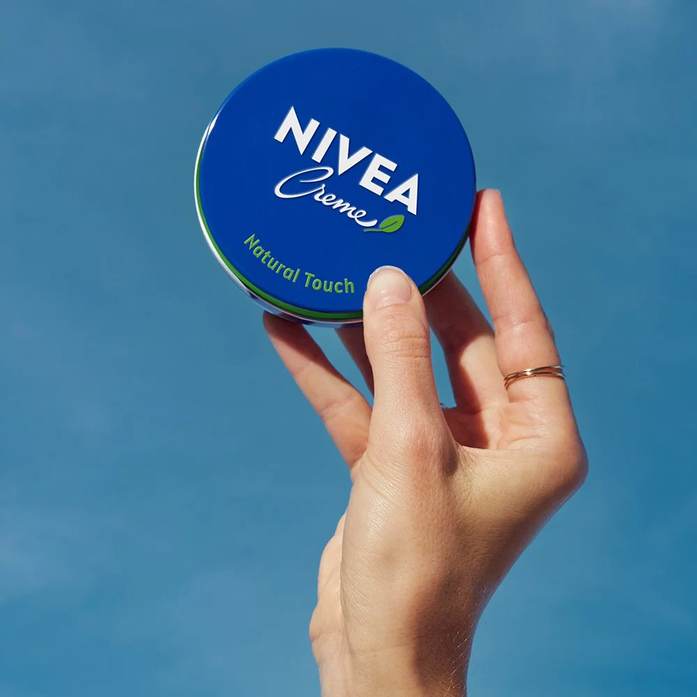
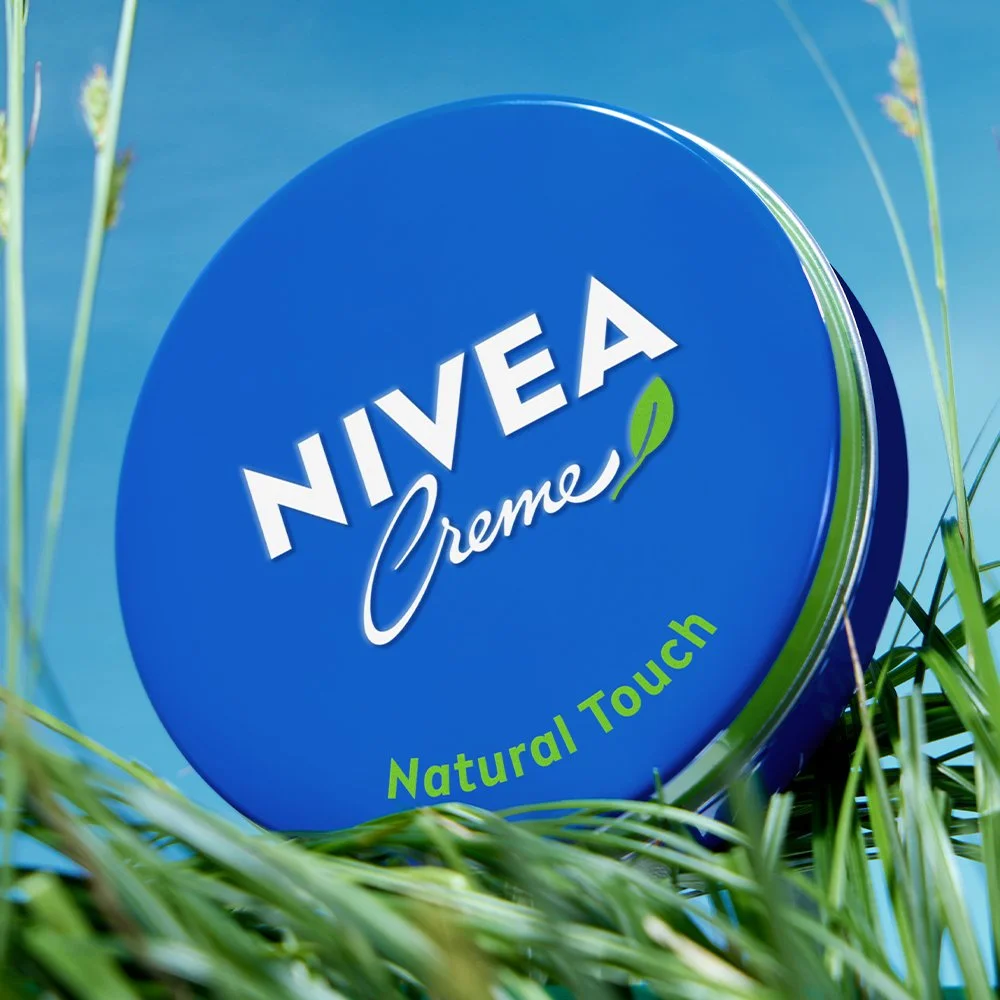
The NIVEA blue tin is as close to a design icon as it gets. You could draw it blindfolded, spot it from across a supermarket, and still feel something when you see it. So when it went green, loyal users raised an eyebrow. Fair enough. But the audience we were going after had been waiting for exactly that — a product that took sustainability seriously. We're not all the way there yet, but 99% of the way deserved to be recognised. So we used the icon's credibility to invite the new ones in, playing in nature itself. A fine balance of keeping both worlds in check.